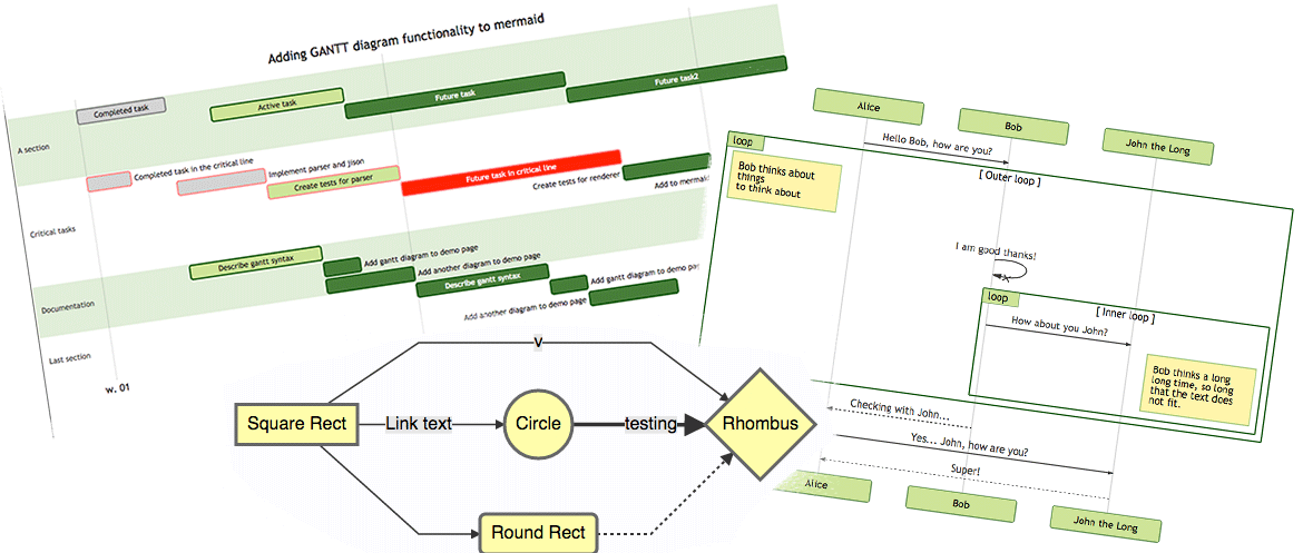
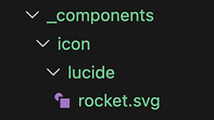
#
Tag: component
See all tags.
The Backlinks component displays a list of pages that link to the current page. By default, backlinks are automatically included at the end of each page, but you can manually place them anywhere in your content using the [!backlinks] markdown component syntax.
Similar to a Button, the Badge component uses the same syntax as a hyperlink, but is prefixed with a !badge identifier. With the Badge component, the link is optional and can be omitted.
Similar to a Badge, the Button component uses the same syntax as a hyperlink, but is prefixed with a !button identifier.
Callout components help to highlight important messages for the reader. To create an Callout, just surround a block of text or any markdown content with !!!.
The Card component creates a styled preview card linking to another page in your project. Cards automatically display the target page's title, category, description, date, and image.
Blocks of code or any preformatted text can be displayed by wrapping with triple backticks characters before and after.
A code snippet allow you to include the content of another text file or a portion of that file into a code block on another page. A common scenario for using the code snippet component is to include a portion of a source code file located elsewhere within your repository, but not explicitly within the documentation. For instance, you could include code samples directly from the source code of the project you are documenting, or import code being used within a working demo.
Retype automatically detects hex color codes written in inline code and displays them with a visual color preview chip. When you write a valid hex color code using backticks, Retype renders the color value alongside a small circular preview of that color.
The column component is used to create multiple equal width columns with a title for each column. The column component is configured by wrapping any block of content in an opening and closing ||| and setting a title for each column. A column can contain any other content, such as text, paragraphs, links, tables, images, and other Retype components.
Retype supports adding hidden comments to your Markdown files that are not rendered in the final generated HTML. Comments are useful for adding notes, reminders, or explanations that should only be visible in the source Markdown files.
A Container component can be used to wrap any content in a <div> container. A Container component is created by adding ::: above and below any content. In of itself, there should be no visible difference between content inside a Container vs not inside a Container. Visually, the final rendered content should look the same. For example:
The embed component helps with content embedding. The embed component syntax is similar to many other Retype components. The !embed keyword is used to specify the component and a link to the resource is included. The link is the full URL to the embedded resource. For instance, embeding a YouTube or Vimeo video would require the following component syntax:
Retype uses Mojee to find emoji :shortcodes: within your document and replace with actual emoji characters. 👍 You can place emoji :shortcodes: anywhere within your document, such as :smile: 😄 or :unicorn_face: 🦄. Below you’ll find all available emojis, their shortcodes, aliases, descriptions, and related tags.
A static file download component can be configured by using the !file specifier in a link. File download
Similar to the Emoji :shortcode: syntax, you can add icons using :icon-shortcode:, where the shortcode is an Octicon icon name. For example, to add the star icon, use the :icon-star: icon shortcode. Icons can be added anywhere within your document, including paragraph text, headings, table content, Panel component titles, Callouts, code block titles, etc.
The image component embeds an image in your document. You can point to image files stored within the project, or an external URL. Checkout the Markdown Guide for more details on configuring images.
Retype includes broad support for creating lists of items, including unordered, ordered, and description lists.
Retype supports rendering math formulas written according to the LaTeX grammar. Internally, Retype is powered by \KaTeX and supports all syntax of the library. Math equations can be rendered inline by wrapping the equation in $ characters, or as separate blocks by fencing the equation in $$ characters.
Mermaid is a diagramming and charting tool that can be defined inside Markdown code blocks.
A Panel is created by surrounding a block of content with === and including a title for the Panel. The title must be separated from the opening === by one space. The pattern === My Panel will work as expected, and ===My Panel will not. Multiple Panels can be stacked by repeating Panel component configurations.
A special type of reference link can be configured by using the !ref specifier in a link. Reference link By default, the text of the link is not required if the .md page you are linking to is within the project. Retype will automatically use the label of the .md page as the link text.
A Steps component is created by surrounding a block of content with >>> and including a title for each step. The step title must be separated from the opening >>> by one space. The pattern >>> Step 1 will work as expected, and >>>Step 1 will not.
With Retype, a Tab component is super simple to configure by surrounding a block of text with +++ and including a title for the tab. The tab title must be separated from the opening +++ by one space. The pattern +++ Tab will work as expected, and +++Tab 1 will not.
Tables are configured using a combination of | pipe characters to separate columns and at least three --- dashes to separate the header row from the table body. The following sample demonstrates a basic table configuration: The above configuration creates the following table in the final generated website:
Retype makes it easy to embed YouTube videos in your documentation. Simply place a YouTube URL on its own line in your markdown file, and Retype will automatically convert it into a responsive embedded video player.